

Monday, January 4, 2016
Society6!
Be sure to go to Society6.com and get free shipping! I've just started to post some of my own art and am hoping to get back into the swing of painting on a regular basis. I should have three up by the end of this week if work isn't too crazy. In time, I will start to focus on designs for iPhone cases in particular that will include oil, acrylic, watercolor, charcoal, pastels, and pencil. Cheers!
Monday, December 28, 2015
Half Bath Makeover

It's amazing how much cheering up a bathroom can do for your home. I am a big fan of color on the walls, and mixes of beautiful textures, so I decided it would be nice to spruce up my half bath on the main floor. I am a huge fan of the color green, in fact, almost my entire home is painted green, so I decided to make an exception for the half bath. I went with a vibrant, but rich golden yellow color. I especially wanted the bathroom bright, because there are no windows and natural can only enter through the open door.


For color interest and fun, I purchased two guest towels from H&M in a bright red. These are perfect for half baths because of their size and light texture.
I've also always been a fan of Turkish towels, so I also found two small light orange Turkish towels off Etsy that I just love.

I purchased a small dark orange pattern mat for the room, a basket and additional towels in warm colors and white to add to the space. The other advantage of having additional towels is that if you have guests over you can switch out towels if they become saturated with water from people washing their hands.
I also wanted to incorporate some of my own art, which includes an abstract painting and drawing of my darling baby puppy dog, Oppie. The abstract isn't quite done yet, but getting there. :)

Finally, I topped the room off with a few decorative items and a set of circular mirrors from Target, which I've received multiple compliments on!
In the future I would like to add a few hanging lanterns, and possibly paint the cabinets a rich espresso color and add hardware. Have a great weekend and cheers!
Wednesday, October 28, 2015
My Five Functional Design Rules
1. Indoor/Outdoor Rugs in
the Dining Area: Sounds silly, but having an indoor/outdoor rug under my
dining table has been one of the best decisions I've made for my kitchen. Prior
to my current dining table and chairs I had a completely different set and a
different rug as well. I had originally had a square table with a rectangular
rug. It looked cute, but I didn't think through the rug at all. I had chosen a
shag rug, and it was nearly impossible to keep clean. It just trapped
everything from dust to food to dog hair.
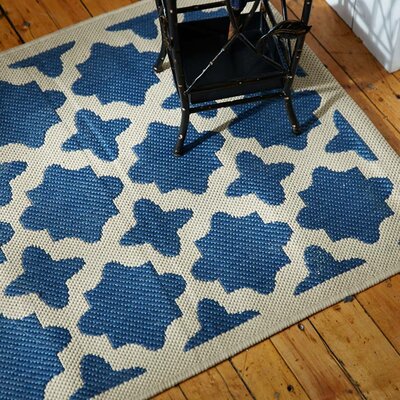
It was an absolute pain so when I went with my second table, which
was a high top, I didn't use a rug at all. This was in a very small apartment
in the Westport area and that worked out well for that space. Once I moved into
my row home, I realized that I would eventually want a "real" table
and chairs again. I really wanted a rug in there as well to add interest,
texture and color, but was really hesitant to pull the trigger. I chose the
indoor/outdoor primarily because it was cheaper and hoped it would be easier to
clean.
I have been so happy with my purchase! The
best part is I can just sweep directly over the surface and if a liquid is
spilled I can absorb it easily by lifting it up, wiping what leaked through,
and then lightly cleaning the top surface. This may be more challenging
with red wine, but here is
a simple way to clean that up as well.
2. Functional Sofa/Sectionals: Comfort is a priority some designers tend
to overlook, but really isn't functional for day to day use. I don't really
know anyone who wants to lie on a Victorian couch to watch a movie. While decorative
couches serve their purpose well for entertaining and look; they just aren't
always that practical for a home that has one living area. Taking into
consideration you and your family's height, frequency of use, and purpose of
the space is important when selecting functional seating.
Couches can also be very frustrating when they are made of
materials that are difficult to clean or are light colors. I absolutely love
the look of white or cream couches, but would never dare to attempt to maintain
one. I have a black Dachshund that would make a white couch look more like a
Dalmatian. I currently have a black leather couch that I purchased from TEMA in
Albuquerque, NM about eight years ago. It's maintained its shape and is very
easy to maintain in terms of cleaning. Be sure to ask plenty of questions about
the leather or material when purchasing a sofa. I would also recommend
searching for reviews online about the material and not just rely on the
knowledge of a sales representative.
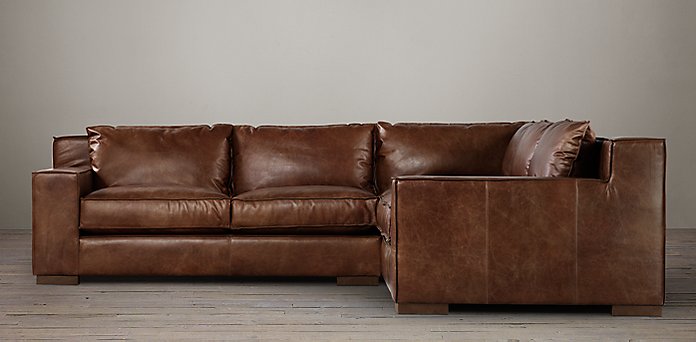
This
is a gorgeous, but a little higher priced leather sectional from Restoration
Hardware. They have a lot of basic and comfortable sectionals like this Capri leather sofa.
3. Don't Crowd Your Walls or Floors: It's easy to get carried away with
decorating and deciding what should stay in a space or go. This can be
especially true for walls. You don't have to cover every inch or section of
wall that is available In dorm rooms, closet spaces, and storage areas this
makes more sense, but not everywhere in your home. Adding more and more
decorative items to a small room can make it feel cluttered and often lose the
opportunity to make the space more practical and functional. Large spaces have
more freedom, but can also distract from architectural details and bog down
natural existing design.
For example, every space between two
windows or a window and a door does not need to be covered in pictures or
decorative items. Often new apartment or home owners will be excited to
decorate and plan out areas of their walls, but it just becomes too much all
too quickly and defeats the purpose of design and creating a tranquil
environment. Decorative clutter isn't much different than just regular clutter.
Using fewer items, higher hung curtains, and mirrors can help add space, light
and an overall feeling of calm in smaller spaces.

Furniture size is also important when selecting pieces to a room.
Even if you aren't adding too many items, if they are too large for the space
you can still end up with a cluttered effect. This really limits your design
options and opportunities to add fun items such as throw pillows, area rugs,
ottoman, console tables, plants, and lamps. Choosing small items for small
spaces is important and when filling a large space it's also important to not
get carried away with filling every available inch. A well designed room can
quickly look like a hoarders dream land if you aren't careful.
4. Organization:
Not only do you want your walls and floors
to be clutter free, you want everything to have its place and even your drawers
to be organized. Most of us have at least one catch-all drawer, but do we
really need that? How often do we actually use those items and can they be
easily organized?
Every room in the house requires
organization. The kitchen drawers can become easily cluttered messes, wires peeking
out from behind TV's and nightstands can create visual clutter, and bathrooms
can turn into makeup and hair product explosions if not regularly kept. Organization
is also not just a one-time act of getting it together; it requires ongoing
maintenance. This maintenance is really the key. One simple trick is every time
you purchase something new, something old has to go. This way you won't
continue to acquire (junk) while updating your closet or kitchen.

5. Lighting: This is something that is almost always overlooked in a
space. Overhead lighting and most built in lighting is just plain harsh,
unflattering, and hard on the eyes. Adding softer lighting that isn't blaring
down on you and your guests in your home will help with ambiance and
potentially avoid headaches and straining of the eyes. It also helps soften the
mood and calm the feeling in the room.

Overhead lighting in most dressing rooms are terrible for example. This woman even went to several major retail stores
and took selfies to prove it. You really don't want your guests (or yourself)
to look horrible over dinner with lights blaring down and creating unflattering
shadows! Just say no!
Energy conservation is another practical
aspect of lighting that is important to take into consideration. Today most
bulbs are measured differently than by watts in terms of their energy
efficiency. Lumens for example can help you choose a
brighter bulb for an area that you would want to have well lit, for example the
bathroom, kitchen, or a room with no windows. The warmth or coolness of the
bulb is also an aspect to consider when creating a specific mood or effect. The
colors in the room (particularly the wall color) can also impact your decisions
and selections for lighting. I personally have used the dining area the most in
every home I've lived in and have really enjoyed my recently added floor lamps
with soft warm bulbs. I have two flanking the table, which provides just the
amount of light for a relaxing dinner or end of day glass of wine and cheese!
Cheers!!
Wednesday, September 30, 2015
Bird Painting Number One

I've been wanting to spice up my dining room for some time
with personalized paintings. Finally, I'm getting around to starting them. I
had four canvases that I originally purchased for my spare bedroom. Instead, I
decided to use them in the dining room, since
there is more traffic in that space and they will
be enjoyed more there! I purchased four more for the spare bedroom
and chose to stick with a color scheme that
will work for both spaces. I'm hoping to switch them out if I grow tired of one
or the other during the year.

Deciding what subject to paint was not too difficult. I had either floral themes, birds, or food in
mind. I decided to go with birds. For the spare I'll probably do floral to keep
things versatile. I nixed the food, as it
limits that art to be used almost exclusively in a dining or kitchen area.
Next step was to choose a medium. I settled
on oil. Not only is it a great medium, but a friend
is wanting a very large oil done for her living room and I figured this would give me a
chance to "brush up" my skills on
some simple art for my own wall.
If you haven't used oil before, you may want to practice
with it a bit before you jump into it. One of the most distinct differences
between oil and other paints is the ability to paint "wet on wet." In
other words, you don't have to wait for it to dry. Watercolor, for example,
will bleed all over the place if you have two wet surfaces touching. Oil
doesn't work that way. It allows you to continually work with the
painting.
For this one I started with a simple base that was a
contrasting color (warm) in order to create some interest around the edges of
the shapes I'm attempting to create. This adds some visual interest and also
prevents any blank canvas from showing.

After creating the base layer, I lightly drew the outline of
the bird, stems and leaves. I made the first layer really
thin by adding paint thinner, which caused it to
dry almost immediately. I then moved on to
creating a blue background using prussian blue and ivory. I used several of the Burnt colors to create the
outline of the bird and stem. In addition, I added
some of the Cadium colors and more reds to lighten the feathers.

Slowly, I continued to add detail and highlights to the
piece and the bird. This is purely done at your preference. I also thickened up
the tail of the bird as I went as well. It was challenging deciding how much
white I wanted on the edge of the bird and the birds face, but ended up dulling
it down a bit.


The Veridan green was added last to the leaves. I made sure some of the bright base tone peaked
through around the leaves and stem. I also allowed some to peek through at the
top of the painting just to add some depth and interest.

Overall I am definitely pleased with my first attempt at
revamping my oil painting skills. Hopefully I'll be able to finish the other 3
quickly and move on to the monster canvas that my friend Nancy selected for her
wall. In the meantime I'm going to enjoy the fruits of my labor with a nice
glass of wine. Cheers!
Wednesday, September 23, 2015
Happy Autumn!

Nothing beats a latte and how great is it to be able to make it at home! I love coffee and espresso so this seemed like an obvious purchase for me. If you haven't figure it out yet, I love IKEA. It's such an easy and cheap way to make simple updates to your home, especially when you are single and in your 20's and 30's. Some of my favorite IKEA purchases are kitchen gadgets. I would love to buy a nice espresso maker with a steam frother, but that's not exactly in my working student budget. The RÅDIG Espresso pot was a great option, especially for only $19.99! I also had already purchased the MÅTTLIG Milk-frothing jug for $6.99 and the PRODUKT Milk-frother for only $2.79.

The process of making the espresso is extremely simple and the IKEA espresso pot includes detailed directions in almost every language. Basically you fill the bottom portion with water to just below/at the safety valve, add the ground espresso to the funnel filter and place it on the stove! Voila! You've got espresso in no time!
I added some milk to the frothing jug and heated it up as well. The milk frother is not the most efficient and takes a lot of time to get a decent amount of frothed milk. There should only be a little left in the bottom that is not frothed.

The best part of making these at home though is adding the flavor. The commercial chains and grocery store products have a lot of added processed sugar and I personally like to know what exactly is going into my coffee or drink. My favorite combination is vanilla and cinnamon and just simply add the vanilla to the milk before I heat it up ans sprinkle the cinnamon on top. Cheers!
Monday, September 21, 2015
Crime Scene Victim Halloween Make-Up!

Last year I decided to lay low for Halloween and instead enjoyed some pre-partying time doing a friend's make-up for a group costume contest. It turned out better than I expected and was a ton of fun to do. My "victim" was a good friend of mine who was part of a group costume that included a victim, murder, and detective. This is a really fun and different group costume that is easy to DIY

First step was to
glue on the fake stab wound and add the slit throat. These items come with glue, just keep in
mind that you will need to use a lot of it to attach something that is
projecting out from the body. It
will take some time to dry so be sure to start early enough. One tip for the
edges of the slashed throat would be to run your fingers along the seam to keep
the edges as smooth as possible. This way the makeup you add will look as
natural as possible.

Next step was to
add some contouring (any contouring kit should work just fine).
I used cream based products
& tried to use more of the cool tones instead of warm to help with the "dead"
effect I was shooting for. Be sure to go over the lips with a light
color. You don't want to blend it in too much so the natural color peeks
through in any natural cracks or creases in the lips.

Once blended I
added the eye shadow to create a sunken in look. I used the Naked2 palette for
this and primarily utilized the darkest colors. Be sure to take the color below
the eye as well. You are essentially shooting for the opposite look of
health!

Blend the make-up around the glued seams of the false wounds. This will require thicker products or just a lot of extra. This is especially true if the fake skin tone doesn't match up exactly with your "victim’s" natural skin tone.

Next up was to
add the fake blood. Most fake bloods are too red and too thin, so I went with a
darker version that came in a squirt bottle. Be sure to add not only to the
wounds, but the edge of the mouth or the eyes.

Either way it is a
fun and scary costume for Halloween that will be sure to turn heads! Happy
Halloween and Cheers!
Thursday, August 20, 2015
Kitchen Backsplash Stencil

A fun project I started recently was to create an extremely cheap, but functional backsplash. I already had extra paint from my previous painting project in the living room and dinning room areas, so I was able to use that paint in addition to only a few more items! This cut down on costs and used the paint that was just sitting in my basement.

First step I made sure I taped off the edges of the cabinets.

After taping, I removed all of the outlet covers and prepped for painting.

I started off using a drop cloth, but it became fairly dangerous once I had to stand on the counters to reach the top portion of the walls above the cabinets. I highly recommend not standing on the drop cloth unless you can find a way to secure it and prevent any risk for slipping.
For the base paint colors, I decided to mirror the dining room wall with the same dark green called Behr Alligator Skin from Home Depot. I had painted opposing walls in the living room and one wall in the dinning room. I decided to keep things consistent with all of the first floor area (minus the half bath). The other walls are painted also with Behr paint in the color Wasabi green shown below. I chose both in a matte finish, which I do not recommend if you have children, but it worked out great for this project.

If you are using latex paint you haven't used in a while, be sure to stir well and also add some water if need be. I personally always prefer latex for interior wall paint over oil bases just to cut down on the mess.


This is the far left corner of the kitchen near the refridgerator. I decided not to continue the stencil above the cabinets to really create a backsplash effect instead of a wall detail effect. Of course, it always would be an option to continue the stencil pattern above if you prefer.

Here you can see the paint is on the wall and now it's time for the challenging part! I decided to add a Polycrylic, also from Home Depot to protect the paint against splashes and messes. I didn't even use a quart, so it really didn't require much Polycrylic at all to cover the small area. I chose a simple stencil pattern to add some interest as well! Note: the areas that are exposed from the stencil will not be protected, so you may want to avoid too large of a pattern with thick lines on your stencil. It hasn't been a problem so far and still looks much better than my plain matte white walls from before.

I purchased a stencil from Michael's made by FolkArt that was simple and I liked the size for such a small area. This was extremely cheap (only $5.99) and is a very thin, almost flimsy stencil. If you struggle with stenciling and brush work, you may want to purchase a thicker one. I felt confident using this one and had no problems with it's sturdiness or flexibility. I also was not shooting for the stencil to be perfect in order to add some character and charm.

Make sure you line up each stencil by overlapping to ensure you are staying in line with the exposed areas that are not covered in the Polycrylic. Any areas that seem off or you aren't happy with you can just go over with the center section of the stencil once it's dried. Also you can touch up the exposed pattern with paint using a small watercolor brush.
I also used a mini sponge roller, which will cause some texturing when you use a Polycrylic. If you want a smoother effect, be sure to use a traditional mini roller, not a sponge roller. Initially the sponge roller looks like bubbles, but it dries looking a little like the surface of concrete.
In the process of working on this project I also learned it's much easier to start the stencil at the top and work your way down when working under a cabinet in a small space. The edges that don't line up perfectly are not easy to manipulate from an upward direction. One option with solving this, if you are looking for an extremely clean and perfected look, would be to purchase a few stencils and cut them to line up with the overlapping edges. I just held the edges down with my fingers and dabbed with a brush. There is a chance you will bend the stencil when doing this, so be sure to get the large areas covered first and then start on the edges.

Also, for the edges that the roller couldn't reach, including the sockets, I simply dabbed extra Polycrylic into the corners. Again, I was not shooting for a perfect look so this was not too time consuming and I used a cheap older brush for the job.

Here are the end results!

It's very difficult to see in photos, but is definitely noticeable in person. The light is reflecting in a way that it doesn't seem to catch the camera, but it turned out just the way I wanted. Now time to enjoy! Cheers!
Subscribe to:
Comments (Atom)